Project Overview & Client
The purpose of this project is to develop a web platform that provides arguments challenging carbon capture and storage (CCS) technology and advocating for a shift in support towards renewable energy solutions. In response to the evolving perspectives of Dr. Charles Harvey, a renowned expert in civil and environmental engineering at MIT, my team set out to design and develop an engaging and informative advocacy website.
My Role
Product Management
UX/UI Design
My Team
1 Product Manager
1 Research Lead
1 Technical Manager
1 Design Lead
Type of Project
Industry Sponsored through Human Factors in Product Design Course
Project Timeline
Sept 2023 - Dec 2023
The Challenge
Carbon capture and storage (C.C.S.) is advocated as a green energy solution, with the US government is investing billions of dollars for its proliferation. The climate crisis is a critical contemporary issue and valuable resources are being used to develop technology that doesn’t effectively reduce carbon emissions.
Our Goal
To design and develop an intuitive website that clarifies the environmental implications of carbon capture and storage (C.C.S.), and advocates for redirecting resources from C.C.S. toward renewable energy solutions.
Discovery
We initiated our research by gathering primary data directly from our client including his own academic papers and studies. This provided us with a deep understanding of his work on Carbon Capture and Storage (C.C.S.) technology and the specific features he envisioned for the website. By aligning our research with his vision, we ensured that the website would effectively address his objectives and incorporate the critical elements he identified:
Audience: The site should target policymakers, scientists, media professionals, and climate activists to promote informed discussions and actions.
Funding Issues: Address the flaws in existing policies, such as the 45 Q subsidy, that support C.C.S. technology.
Alternative Solutions: Highlight and advocate for alternatives to C.C.S. technology to support policy change.
In addition to using Dr. Harvey’s materials, we conducted secondary research to broaden our understanding, reviewing academic articles, news reports, and studies on C.C.S. technology. This approach helped us identify a key issue: the accessibility of scientific concepts to a broader audience.
We discovered that complex scientific ideas were often poorly communicated to non-specialists, which underscored the need for our website to present information clearly and engagingly, making it accessible to both experts and the general public.
Our Users Needs & Requirements
After completing our primary and desk-based research, we distilled five key findings from each into clear user requirements, guiding the website's content, presentation, and UI design.
Design Process
Defining Visual Language (UI!)
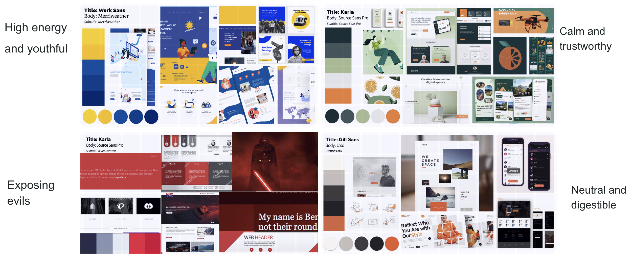
With iterations to version 2 of our wireframe, our team also created mood boards and UI documentation to define the website’s visual identity. We aimed to develop a clear and consistent style guide. Each member crafted a distinct mood board showcasing visual elements, color schemes, typography, UI patterns, and graphics to illustrate the different emotional tones we wanted to convey about our message. After consulting with our client, we selected Moodboard 2 as the final choice and integrated its strongest elements into a cohesive final mood board
In my design process, I embraced a hands-on test and verify approach to refine my wireframes and guide decision-making. By iterating through different wireframe versions and closely examining key metrics like user interaction rates and time spent on each page, I gained insights into how well my designs connected with users. This approach allowed me to identify what was working and where adjustments were needed, whether it was fine-tuning visual hierarchies or improving navigation. Diving into user feedback and engagement data helped me craft designs that were not only visually appealing but also effective and engaging for users.
Site Map
After completing the discovery process, my first step was to develop a comprehensive site map. This was a crucial step in translating the insights gained during research into a coherent and user-friendly structure. I started by identifying the core content areas and key features that needed to be included, ensuring that they aligned with the project's objectives.
A/B Testing using BeGaze
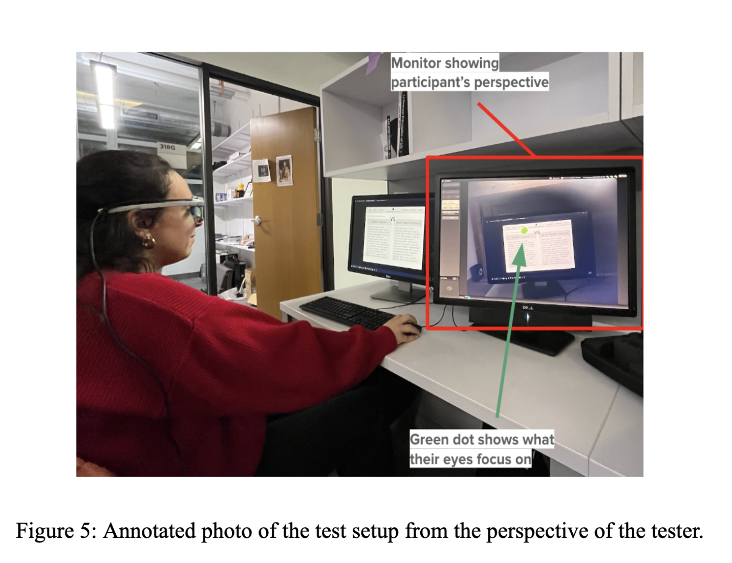
We evaluated our two wireframes with five participants using BeGaze eye tracking technology. We analyzed eye movements by creating heat maps to understand navigation patterns and attention levels for each wireframe. The analysis revealed that all participants preferred Version 2 over Version 1. Participants struggled with understanding lengthy titles and found visuals and motion effects more engaging.
Back to the Drawing Board with Wireframe 2
The key feedback highlighted the need to make the connection between carbon capture and fossil fuel dependency clearer. Leveraging my background in scientific illustration, I chose to create custom visuals instead of using complex scientific graphics. This decision was pivotal in our wireframe design, as it allowed us to present intricate ideas in a more straightforward and engaging manner. By incorporating intuitive, tailored graphics, I addressed the feedback directly, enhancing the clarity and navigability of the content, and improving the overall user experience.
Our Solution
Wireframes
In our design process, we split into pairs to create two distinct wireframes for testing. The first wireframe focused on detailed textual content to establish credibility and thoroughly communicate complex ideas. The second wireframe used infographics to simplify and visually enhance the research arguments. This approach allowed us to evaluate which design philosophy (depth and detail versus visual simplicity) most effectively engaged users and optimized their interaction with the content.
Our final solution addresses key findings from our design process by incorporating user feedback into a refined high-fidelity prototype. Based on insights from wireframe B, we focused on clear, engaging visuals and animated graphics for the home and green alternatives pages to enhance user engagement. We replaced complex CCS explanations with concise titles and impactful statistics to simplify navigation. The top navigation bar was redesigned with clear, descriptive options to improve usability. By applying our curated mood board and color scheme, we ensured visual coherence and a user-friendly experience, effectively addressing the feedback and findings from our design process.
Reflection
Leveraging Limited Resources for Maximum Impact
With the challenge of limited funding, we explored innovative ways to create a functional, realistic prototype. Using Figma not only saved costs but also allowed us to create a highly detailed user experience that we could present to stakeholders. This experience demonstrated the power of resourcefulness and creativity in delivering high-quality results despite constraints.
Simplicity can be your best friend
One key lesson I learned during this project is the profound impact of simplicity in both design and information organization. Initially, we grappled with complex scientific content that was challenging to convey in an accessible manner. Through iterative testing and user feedback, I realized that distilling information into clear, concise elements not only made the content more digestible but also significantly improved user engagement. This experience reinforced the idea that sometimes, less is more—simplifying both the design and the presentation of information can lead to a more effective and user-friendly product.


